First Artist

|
By PATRICK WINFIELD
My initial impression of this image is the way the photographer portrays the nature in a unique way. He used a mosaic format in a collage for his work, and clearly shows this through the nature he captures and edits. This image in particular has predominantly cool and light colours in this image to create a calming and natural aspect. However, the warm vibes in this image create a contrasting vibe. The deep red against a light blue gives a sense of mystery. The red suggests a certain danger aspect, as if nature has a dark aura and the orange shows a deep energy and fascination about the image. In opposition, the blue symbolises stability, trust and innocence. |
The images seem to be taken outside in a natural light because the shape of the subjects can be seen clearly, however this image may have been edited with artificial light to make them bright, and undeniably have had the colour altered by possible use of saturation in particular.
My Edited Image In The Style Of Patrick Winfield:

|
My edited image is similar to the artist in the way that the layout presents my images in a collage style. -REDO-
|
Second Artist
|
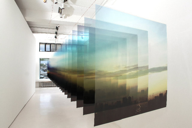
By NABUHIRO NAKANISHI
This image in its entirety stands out greatly as it has manipulated a picture within a picture to be expressed in an uncommon format. The artist has used transparency and duplicated a single image- the image he has chosen is of a silhouette induced cityscape background under a brightness driven sky. It contains the colours yellow and blue, emphasising naturalness and an aura of peace to his image. Whilst the peace is trapped inside Nabuhiro's duplicated image, the outside is of a corridor, the colour white suggesting a pure yet clinical feel. |
|
The corridor is seemingly isolated and the use of a simple, persistent colour gives a sense of emptiness. Therefore, the sunrise image presents new colour and visual, grasping attention and giving the overall image a calming atmosphere.
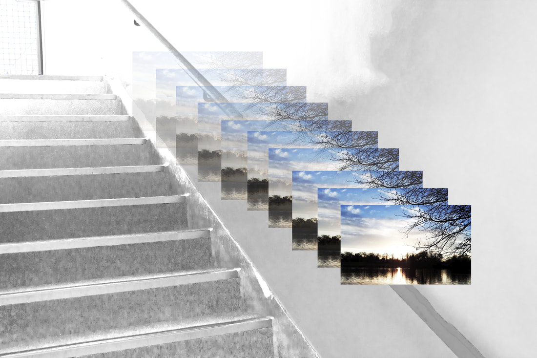
My Edited Image In The Style Of Nabuhiro Nakanishi:
|
I followed Nabuhiro's progression stages and ended up with similar results. For this, I had to take an image initially- it contains a complimentary silhouette form at the bottom which leads upwards to a pleasant, natural sky. I also highlighted the artist's key concept in having a white, clean backdrop for the naturistic images to be presented upon. The image could be improved by creating a sharper and more enlarged effect.
|
|
